Logo
Logo
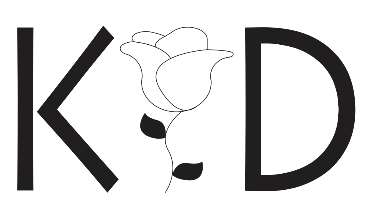
For the logo project I decided to incorporate my first and last initial, and my middle name hidden. My middle name is Rose, so I thought I should create a rose on illustrator using line tools, different shapes, and the merge tool to do so. My mother does not have a middle name and my father had 4, so middle names were and interesting topic in my family. My brother and sister both do not like their middle names as they think they sound too old for them, but everyone in my family loves my middle name even though it is very basic. For the 'K' and 'D' in my logo I decided to use this font because it is very simple yet elegant and I felt it tied everything together. We spoke in class about using large and bold fonts, not dainty curvy fonts that are difficult to read. I felt like overall my logo kind of incorporated both large and bold, and dainty and curvy; the large and bold is depicted in the 'K' and 'D' and the dainty and curvy is shown in the rose. I felt as if this logo really does show who I am because I come off as a small, shy girl who does not speak up, but inside I have gone through if not the same amount than more heartache and trauma then any other person. The trauma I endured made me become the person I am today and even though I may still present my self as dainty and shy, inside I am stronger than imagined.

I really like your logo because it is very professional and almost looks like something someone would get tattooed! I can see that you are very advanced and skilled with this. Great job! And I really like your blog website too, so that's a plus.
ReplyDelete